[Fast Company article, published October 2023]
We’ve had enough of smart city clichés in visual design. Here’s a way to make it real.
Let’s move away from waves of light and flying numbers, and focus instead on showing the tangible difference new technologies could make to a place, and to the lives of people that live and work there.
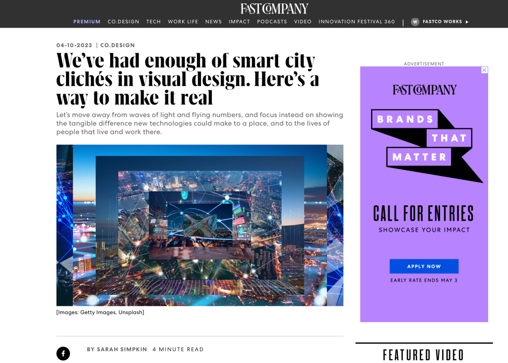
What comes to mind when you think of a smart city? A web of blue and white orbs against an evening sky? Maybe some icons floating above the rooftops, or a wave of binary superimposed on a cityscape? A turquoise infographic or two? Search “smart city” and you can see just how uniform this visual shorthand has become.
Motion blurs and flying numbers over the city are supposed to signify an efficient flow of systems, data, energy, and information. According to colour theorists, blue is the colour of trust and clarity, as opposed to red, used in a similar context to signify risk or data security. The web or net symbol is a very literal way of making visible the idea of connectivity, of linking nodes.
But technology has moved on from the telephone line—it isn’t so linear. In a way, these images are drawing on analogue concepts to try and visualise today’s dispersed, wireless networks. They pretend to map sensors and data points of various city systems, yet are mostly sci-fi fantasy.
Early ideas of the smart city didn’t draw on the same visual references. In 2008, IBM launched their Smarter Planet vision, which proposed exploiting the interconnectivity of power grids, food, water, traffic, and healthcare systems, enabled by “sophisticated analytics and algorithms that could make sense of it all.”
The concept was by Ogilvy & Mather and IBM, and the visual language was developed with San Francisco agency, Office. There were no webs of light but, instead, colourful motifs that illustrated the project’s objectives. As Office wrote in its case study, it was “a graphic language that could illustrate these complicated solutions in a way that was visually arresting and distinctive, yet simple and approachable enough to be easily understood around the world.”
Somehow, from the singular idea that connected technologies could improve urban life, tech firms ended up with a much more nebulous way of expressing this connectivity. You could argue that the resulting imagery has distanced useful technological advances from their purpose—and from the people that could stand to benefit.
And just as these illuminated webs are a bit of a turnoff, so are many visualisations of future transport. I’m thinking of the ones that show beatific couples spirited around in shuttles between futuristic towers in a perpetual golden hour. There is a lie in their two-dimensional promise of the future, because it doesn’t see the city as a holistic, complicated whole. A world with self-driving services may not be so far away, but they won’t necessarily be the defining element of our streets. Some of us will probably still ride old bikes, there will be people walking, wheeling, signposts, deliveries, litter, trees—all the chaotic, unplanned details that give a city life…
Read the full article in Fast Company.
